Dashboards
Datadog dashboards enable you to efficiently monitor your infrastructure and integrations by displaying and tracking key metrics on dashboards.
Integration Preset Dashboards
If you would like to create a default dashboard for an integration, follow the guidelines in the Best Practices section.
Exporting a dashboard payload
When you've created a dashboard in the Datadog UI, you can export the dashboard payload to be included in its integration's assets directory.
Ensure that you have set an api_key and app_key for the org that contains the new dashboard in the ddev configuration.
Run the following command to export the dashboard:
ddev meta dash export <URL_OF_DASHBOARD> <INTEGRATION>
Tip
If the dashboard is for a contributor-maintained integration in the integration-extras repo, run ddev --extras meta ... instead of ddev meta ....
The command will add the dashboard definition to the manifest.json file of the integration. The dashboard JSON payload will be available in /assets/dashboards/<DASHBOARD_TITLE>.json.
Tip
The dashboard is available at the following address /dash/integration/<DASHBOARD_KEY> in each region, where <DASHBOARD_KEY> is the one you have in the manifest.json file of the integration for this dashboard. This can be useful when you want to add a link to another dashboard inside your dashboard.
Commit the changes and create a pull request.
Verify the Preset Dashboard
Once your PR is merged and synced on production, you can find your dashboard in the Dashboard List page.
Tip
Make sure the integration tile is Installed in order to see the preset dashboard in the list.
Ensure logos render correctly on the Dashboard List page and within the preset dashboard.
Best Practices
Why are dashboard best practices useful?
A dashboard that follows best practices helps users consume data quickly. Best practices reduce friction when figuring out where to search for specific information or how to interpret data and find meaning. Additionally, guidelines give dashboard makers a starting point when creating a new dashboard.
Visual Style Guidelines Checklist
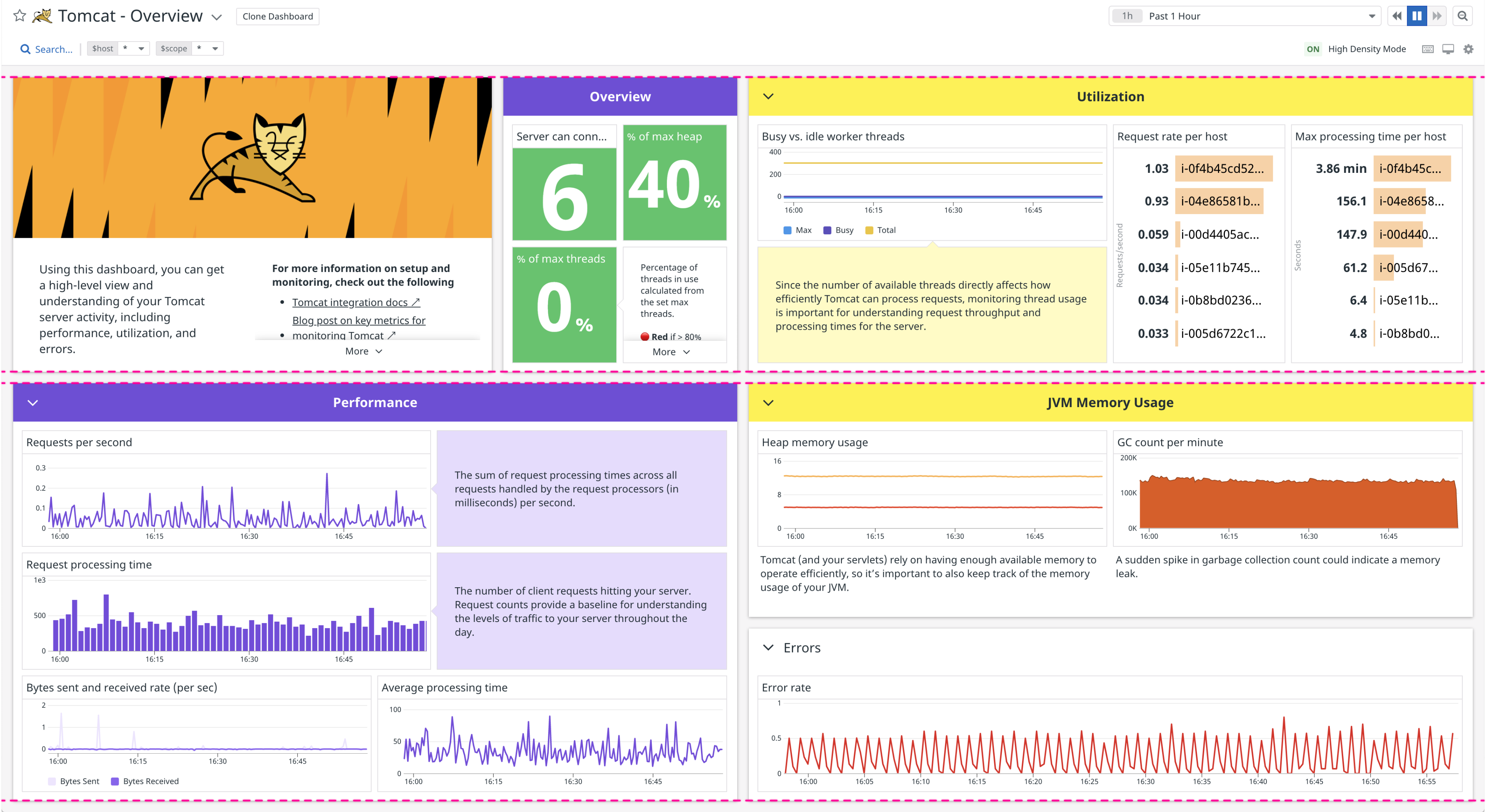
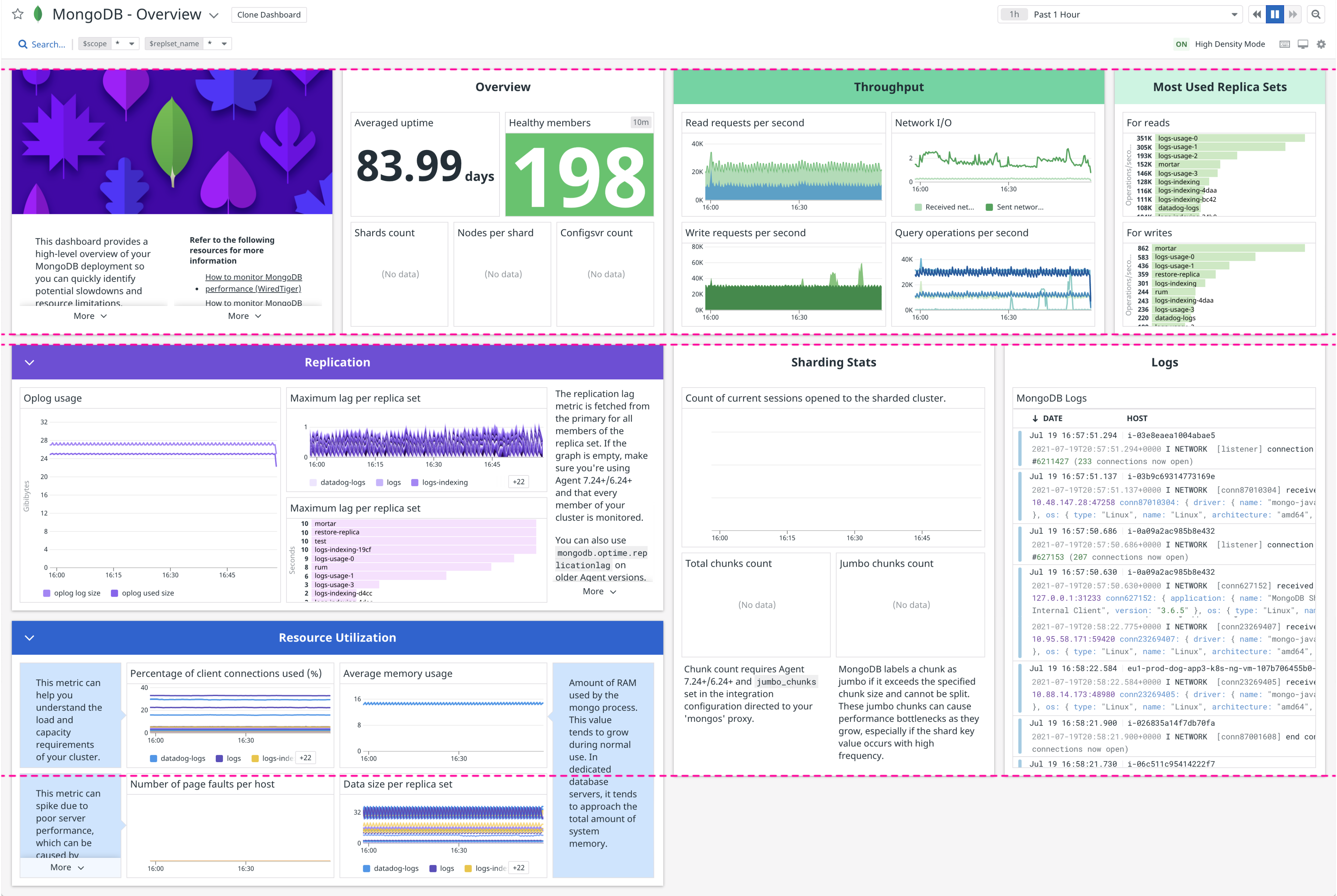
- Attention-grabbing "about" section with the integration logo, concise copy, useful links, and a good typography hierarchy
- A brief, annotated "overview" section with the most important data, right at the top
- Simple graph titles and title-case group names
- Nearly symmetrical in high density mode
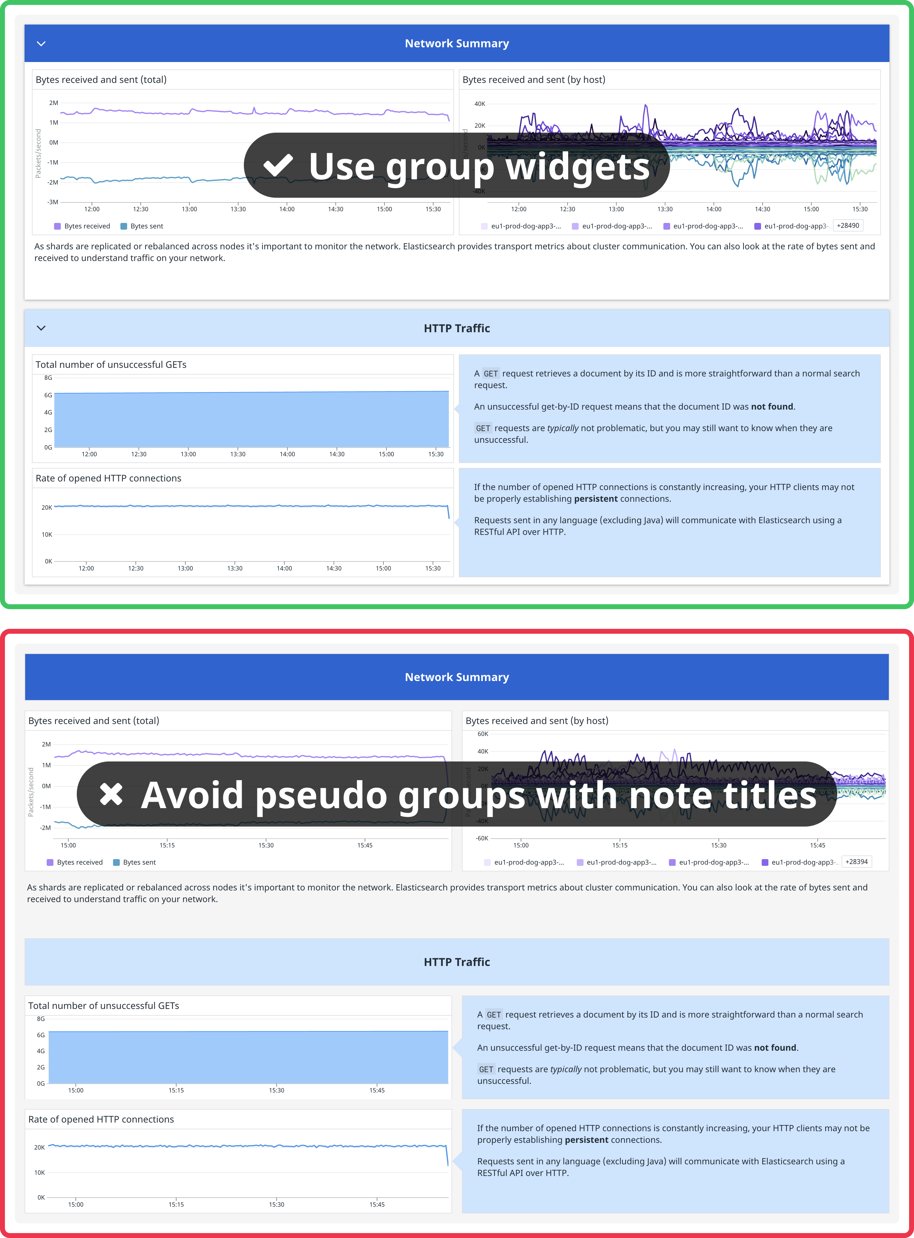
- Well formatted, concise notes explaining the value or purpose of data in each group. Try the presets "caption", "annotation", or "header", or pick your own combination of styles. Avoid using the smallest font size for notes that are long or include complex formatting, like bulleted lists or code blocks.
- All widgets are placed within a group based on thematic organization, rather than directly on the background of the dashboard
- Query value widgets have a timeseries background (e.g. "Bars") instead of being blank
- Visualizations with obvious thresholds or zones use semantic formatting for graphs or custom red/green/yellow text formatting for query values.
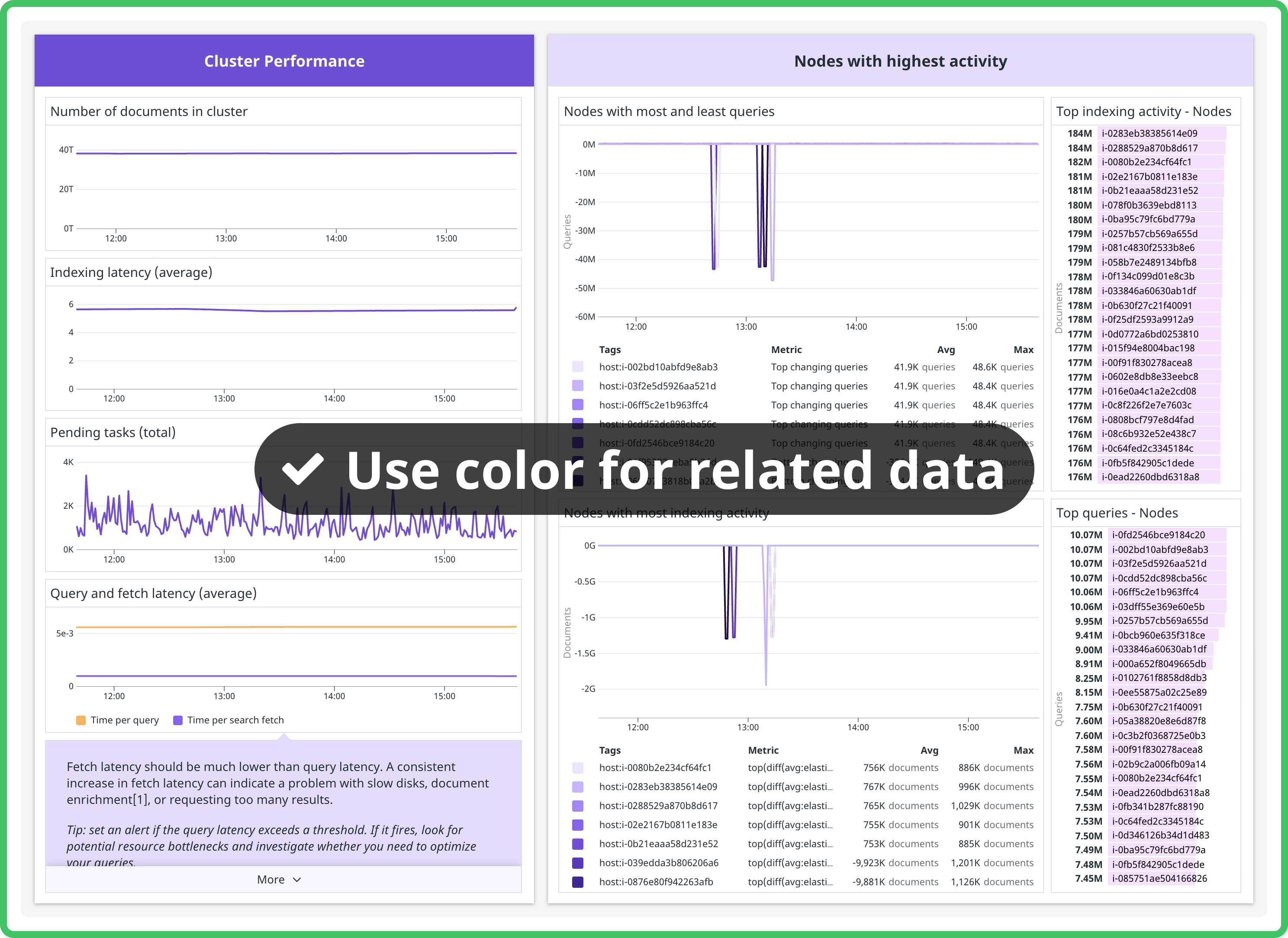
- Color coordination between group headers, notes within groups, and graphs within groups (e.g. all group headers or note widgets the same color). If you've applied a vivid green to all group headers, try making its notes light green.
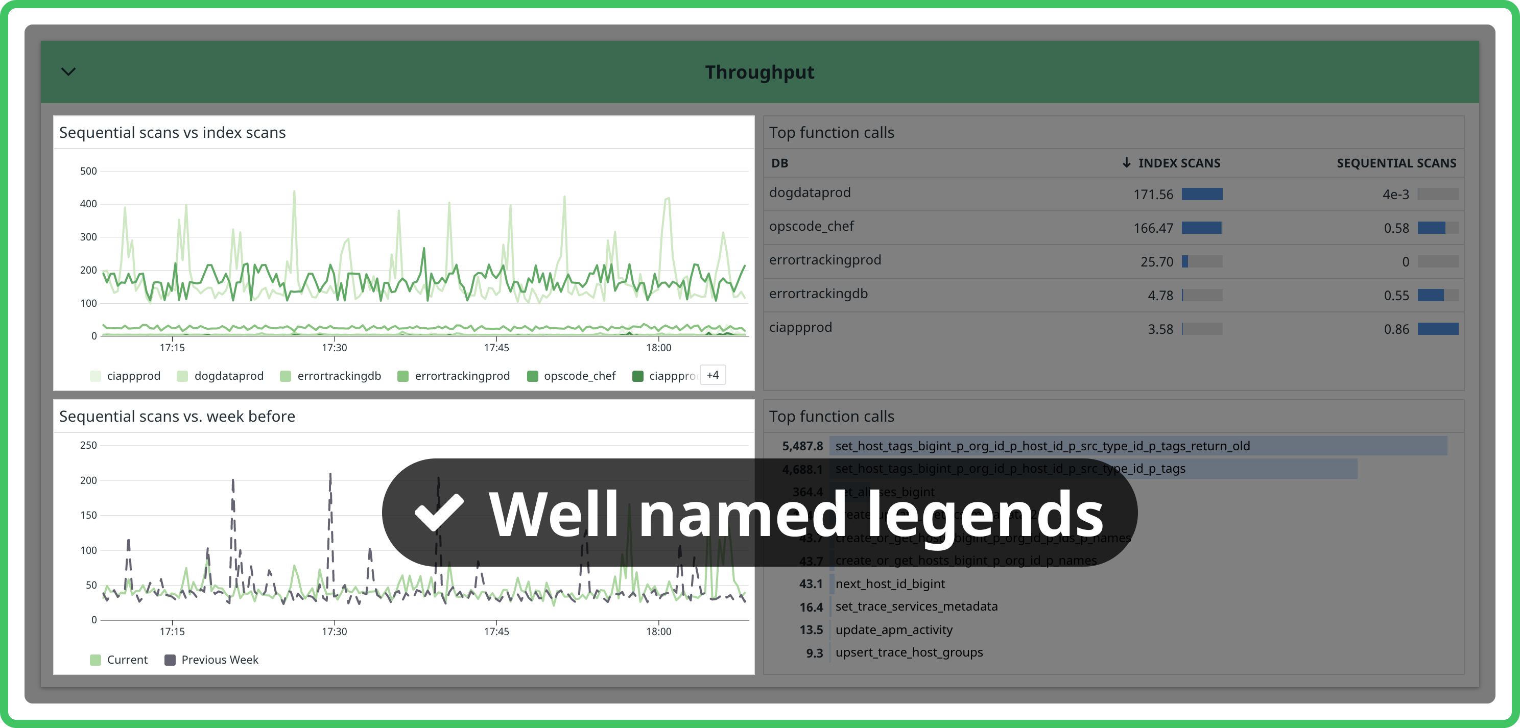
- Legends for each graph. Legends make it easy to read a graph without having to hover over each series or maximize the widget. Make sure you use aliases so the legend is easy to read. Automatic mode for legends is a great option that hides legends when space is tight and shows them when there's room.
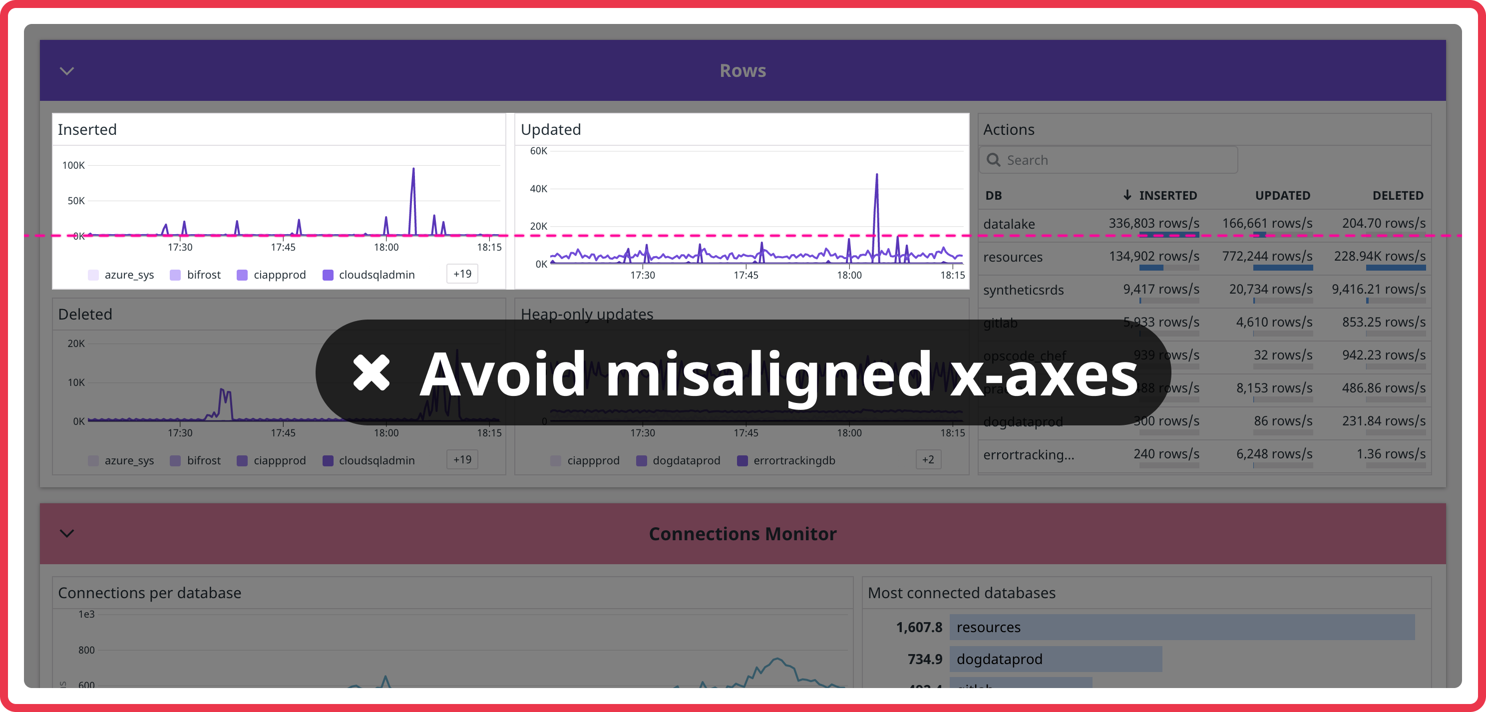
- Adjacent graphs have aligned x-axes. If one graph is showing a legend and the other isn't, the x-axes won't align—make sure they either both show a legend or both do not.
-
For timeseries, base the display type on the type of metric.
Types of metric Display type Volume (e.g. number of connections) areaCounts (e.g. number of errors) barsMultiple groups or default lines
Creating a New Dashboard
-
After selecting New Dashboard, you will have the option to choose from: Dashboard, Screenboard, and Timeboard. Dashboard is recommended.
-
Add a logo to the dashboard header. The integration logo will automatically appear in the header if the icon exists here and the
integration_idmatches the icon name. That means it will only appear when the dashboard you're working on is made into the official integration board.
-
Include the integration name in the dashboard title. (e.g. "Elasticsearch Overview Dashboard").
Warning
Avoid using - (hyphen) in the dashboard title as the dashboard URL is generated from the title.
Standard Groups to Include
-
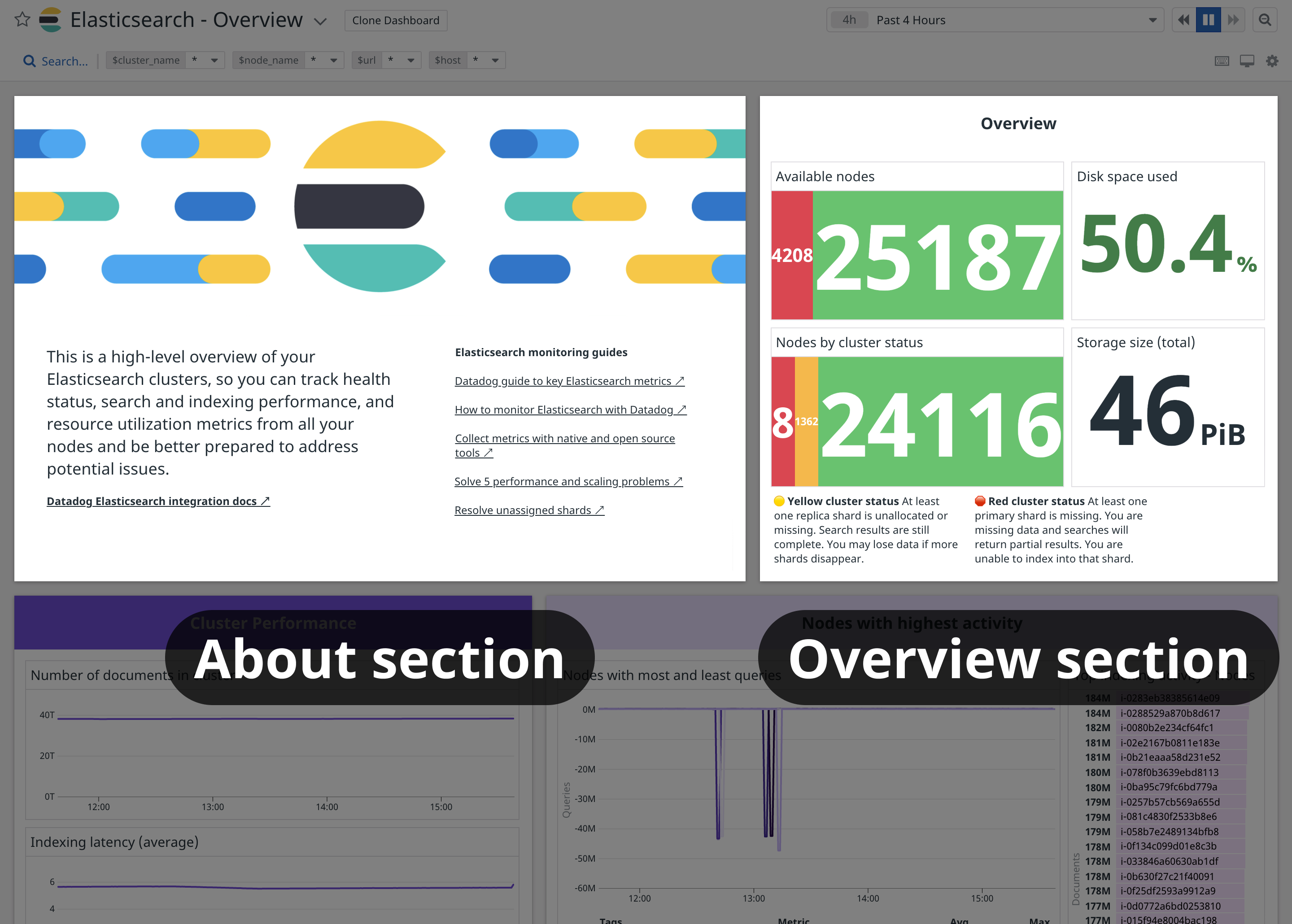
Always include an About group for the integration containing a brief description and helpful links. The first element in the About group should be an Image widget with the Large variant of the integration logo. Link the image like this:
static/images/logos/<your-logo>.svg. To find the correct path to use, go to the DRUIDS logo gallery, click the relevant logo, and click the Large tab. Use both light and dark variant to ensure the logo displays properly for the them selected by the user. The About section should contain content, not data; avoid making the About section full-width. Consider copying the content in the About section into the hovercard that appears when hovering over the dashboard title. -
Also include an Overview group containing service checks (e.g. liveness or readiness checks), a few of the most important metrics, and a monitor summary if you have pre-existing monitors for this integration, and place it at the top of the dashboard. The Overview section should contain data.
-
If log collection is enabled, make a Logs group. Insert a timeseries widget showing a bar graph of logs by status over time. Also include a log stream of logs with the "Error" or "Critical" status.
Tip
Consider turning groups into powerpacks if they appear repeatedly in dashboards irrespective of the integration type, so that you can insert the entire group with the correct formatting with a few clicks rather than adding the same widgets from scratch each time.
Design Guidelines
-
Research the metrics supported by the integration and consider grouping them in relevant categories. Groups containing prioritized metrics that are key to the performance and overview of the integration should be closer to the top. Some considerations when deciding which widgets should be grouped together:
- Go from macro to micro levels within the system (e.g. for a database integration's dashboard, you could group node metrics in one group, index metrics in the next group, shard metrics in the third group)
- Go from upstream to downstream sections within the system (e.g. for a data streams integration's dashboard, you could group producer metrics in one group, broker metrics in the next group, and consumer metrics in the third group)
- Group together metrics that lead to the same actionable insights (e.g. all indexing metrics that reveal which indexes/shards should be optimized could all go in one group, while resource utilization metrics like disk space or memory usage that inform allocation and redistribution decisions should be grouped together in a separate group).
-
Template variables allow you to dynamically filter one or more widgets in a dashboard. Template variables must be universal and accessible by any user or account using the monitored service. Make sure all relevant graphs are listening to the relevant template variable filters. Template variables should be customized based on the type of technology.
Type of integration technology Typical Template Variable Database Shards Data Streaming Consumer ML Model Serving Model Tip
Adding
*=scopeas a template variable is useful since users can access all their own tags.
Copy
-
Prioritize concise graph titles that start with the most important information. Avoid common phrases such as "number of", and don't include the integration title e.g. "Memcached Load".
Concise title (good) Verbose title (bad) Events per node Number of Kubernetes events per node Pending tasks: [$node_name] Total number of pending tasks in [$node_name] Read/write operations Number of read/write operations Connections to server - rate Rate of connections to server Load Memcached Load -
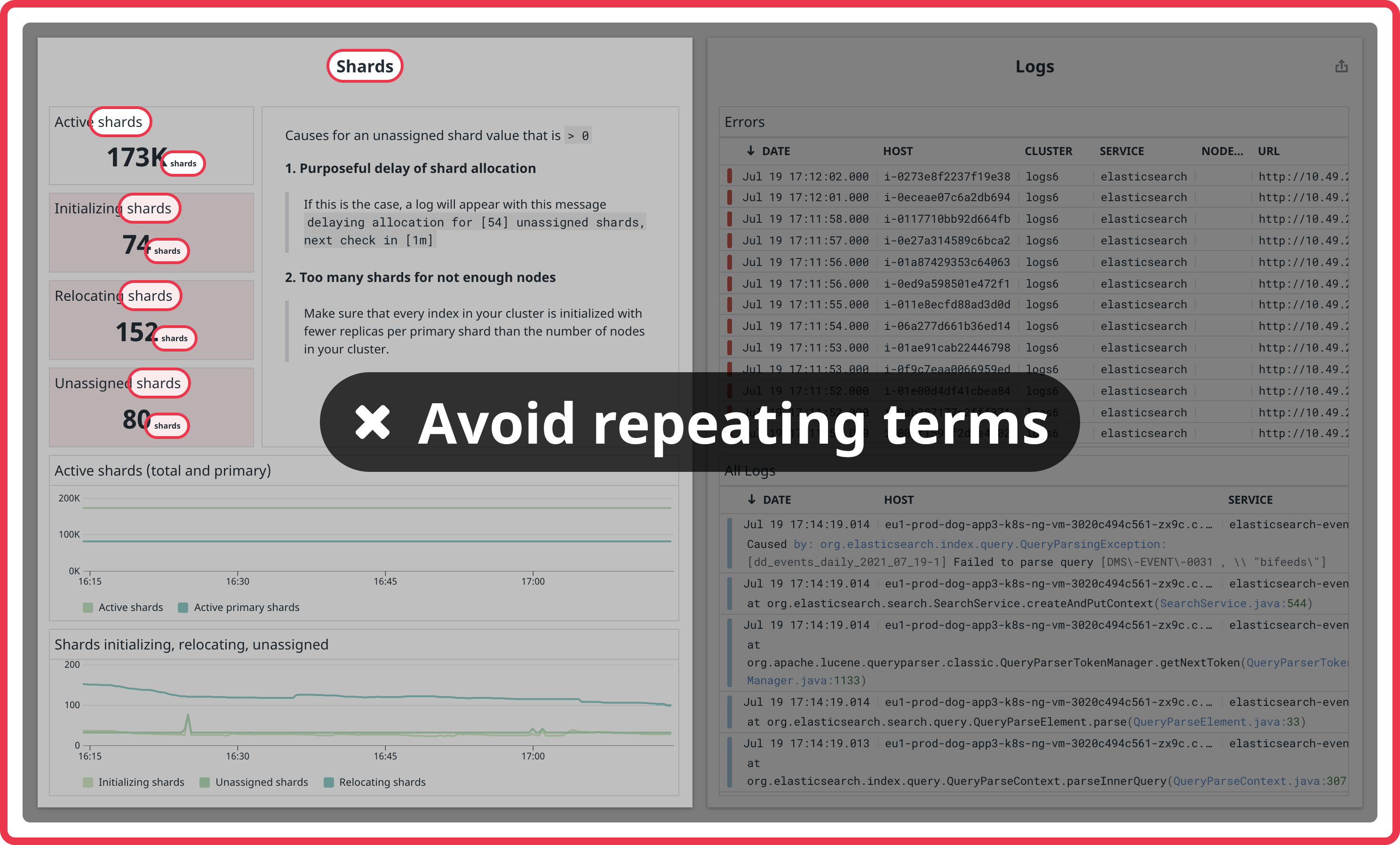
Avoid repeating the group title or integration name in every widget in a group, especially if the widgets are query values with a custom unit of the same name. Note the word "shards" in each widget title in the group named "shards".
-
Always alias formulas
-
Group titles should be title case. Widget titles should be sentence case.
-
If you're showing a legend, make sure the aliases are easy to understand.
-
Graph titles should summarize the queried metric. Do not indicate the unit in the graph title because unit types are displayed automatically from metadata. An exception to this is if the calculation of the query represents a different type of unit.
View Settings
-
Which widgets best represent your data? Try using a mix of widget types and sizes. Explore visualizations and formatting options until you're confident your dashboard is as clear as it can be. Sometimes a whole dashboard of timeseries is ok, but other times variety can improve things. The most commonly used metric widgets are timeseries, query values, and tables. For more information on the available widget types, see the list of supported dashboard widgets.
-
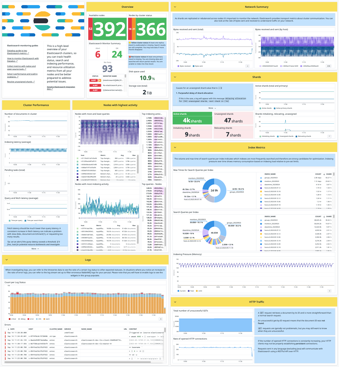
Try to make the left and right halves of your dashboard symmetrical in high density mode. Users with large monitors will see your dashboard in high density mode by default, so it's important to make sure the group relationships make sense, and the dashboard looks good. You can adjust group heights to achieve this, and move groups between the left and right halves.
a. (perfectly symmetrical)
b. (close enough)
-
Timeseries widgets should be at least 4 columns wide in order not to appear squashed on smaller displays.
-
Stream widgets should be at least 6 columns wide (half the dashboard width) for readability. You should place them at the end of a dashboard so they don't "trap" scrolling. It's useful to put stream widgets in a group by themselves so they can be collapsed. Add an event stream only if the service monitored by the dashboard is reporting events. Use
sources:service_name.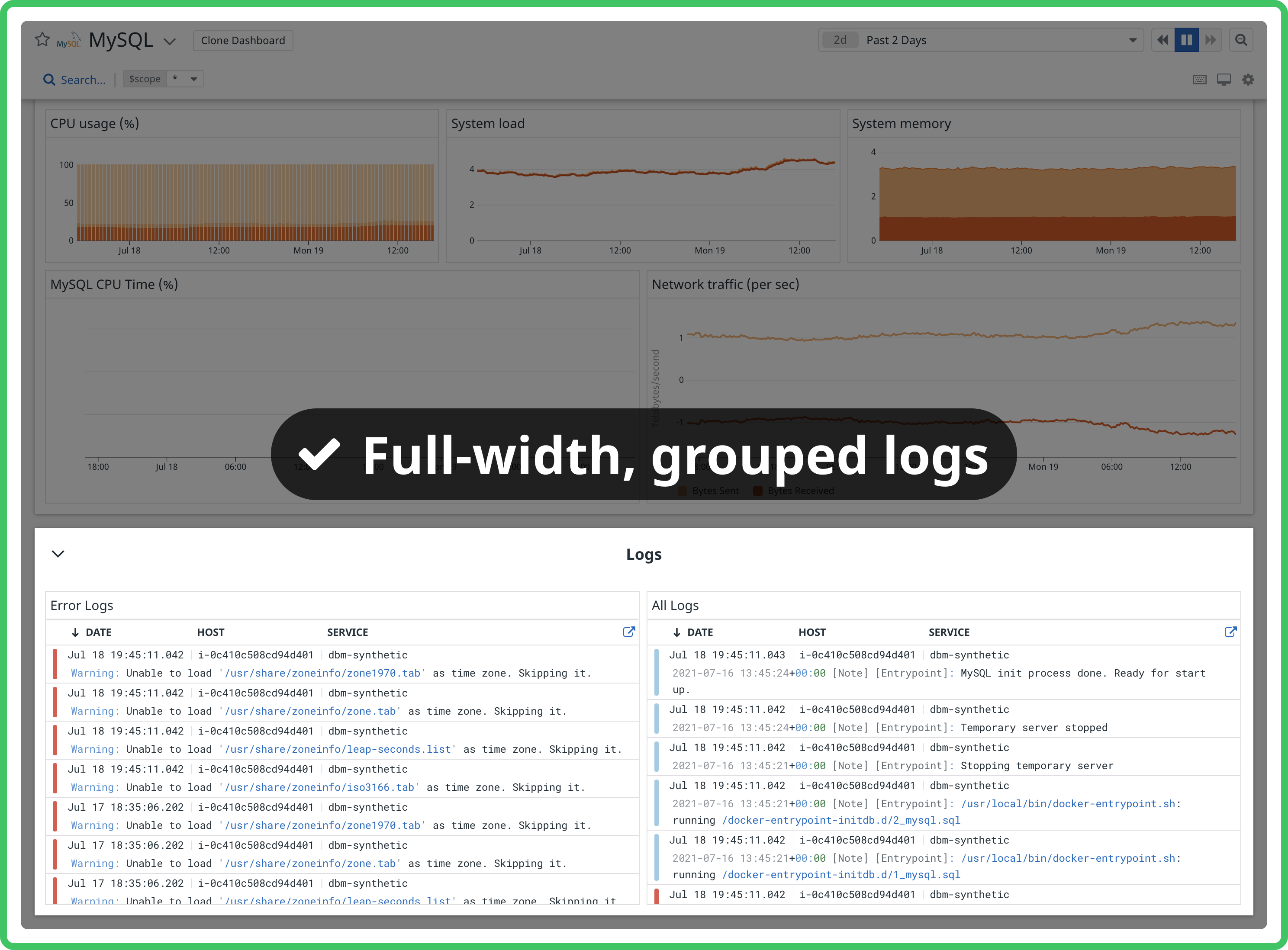
-
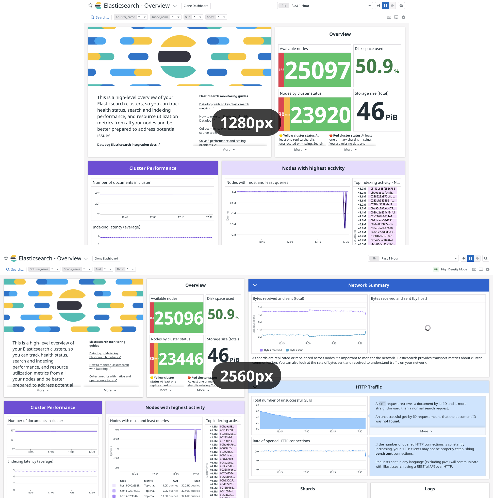
Always check a dashboard at 1280px wide and 2560px wide to see how it looks on a smaller laptop and a larger monitor. The most common screen widths for dashboards are 1920, 1680, 1440, 2560, and 1280px, making up more than half of all dashboard page views combined.
Tip
If your monitor isn't large enough for high density mode, use the browser zoom controls to zoom out.